Health GeneTech
Project Overview
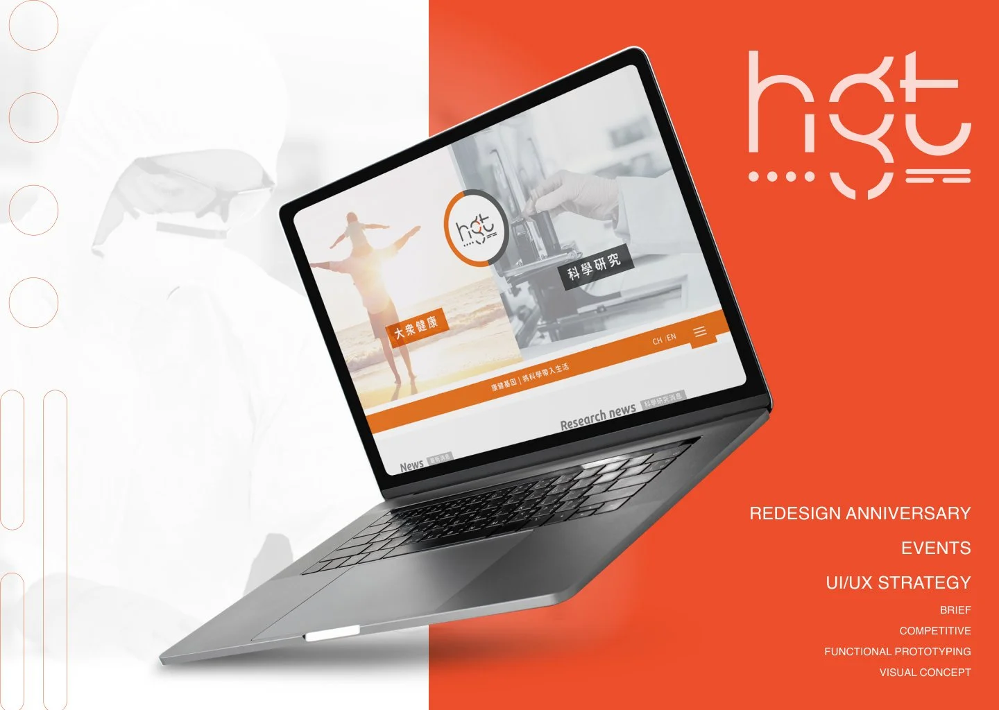
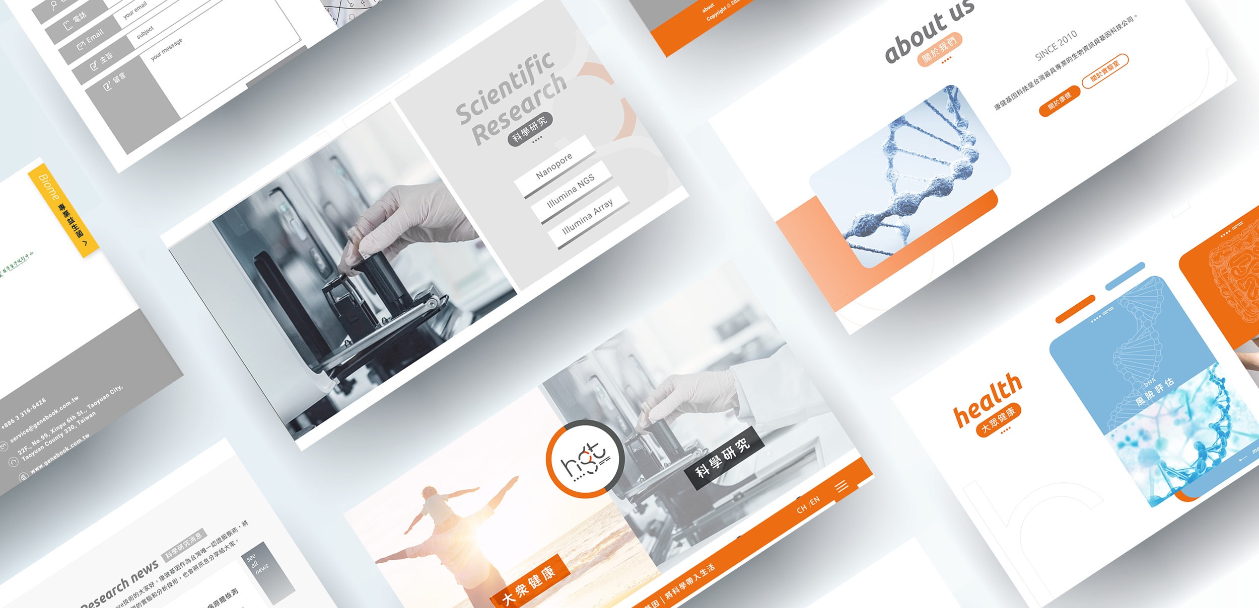
Marking the 10th anniversary of Health GeneTech Corp., a leader in Taiwan’s biotechnology sector, I led a comprehensive 4-month rebranding initiative. As the Lead Product Designer, I managed the end-to-end transformation of the Corporate Identity (CI) and the official website, shifting the brand from a traditional "B2B lab" image to a professional yet vibrant "human-centric health partner".
Role: Lead UI/UX & Product Designer
Key Deliverables: Brand Identity (CI), Information Architecture, Responsive Web Design
Duration: 4 Months
Beyond Lab Results: Your Personal Body Code Decode
*
Beyond Lab Results: Your Personal Body Code Decode *
I redefined the communication tone to bridge the gap between complex science and user accessibility.
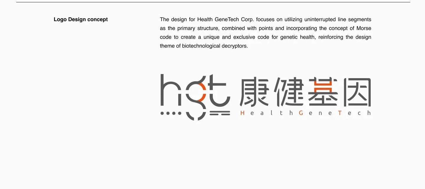
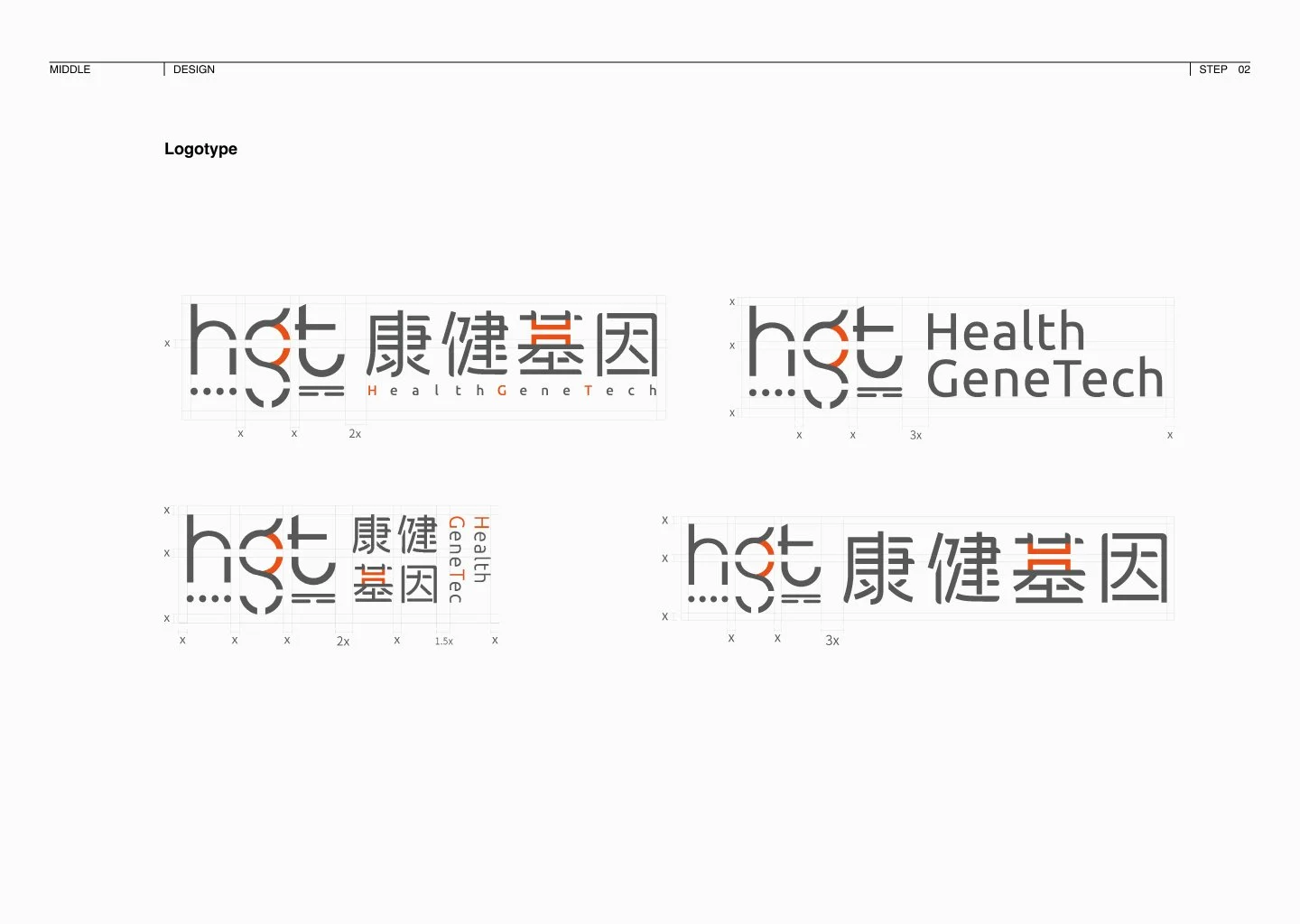
Morse Code Concept: I replaced the outdated human-shaped trademark with a sophisticated logo inspired by Morse Code. This symbolises that while DNA is the "source code" of life, Health GeneTech acts as the expert "decoder," translating genomic data into understandable health insights.
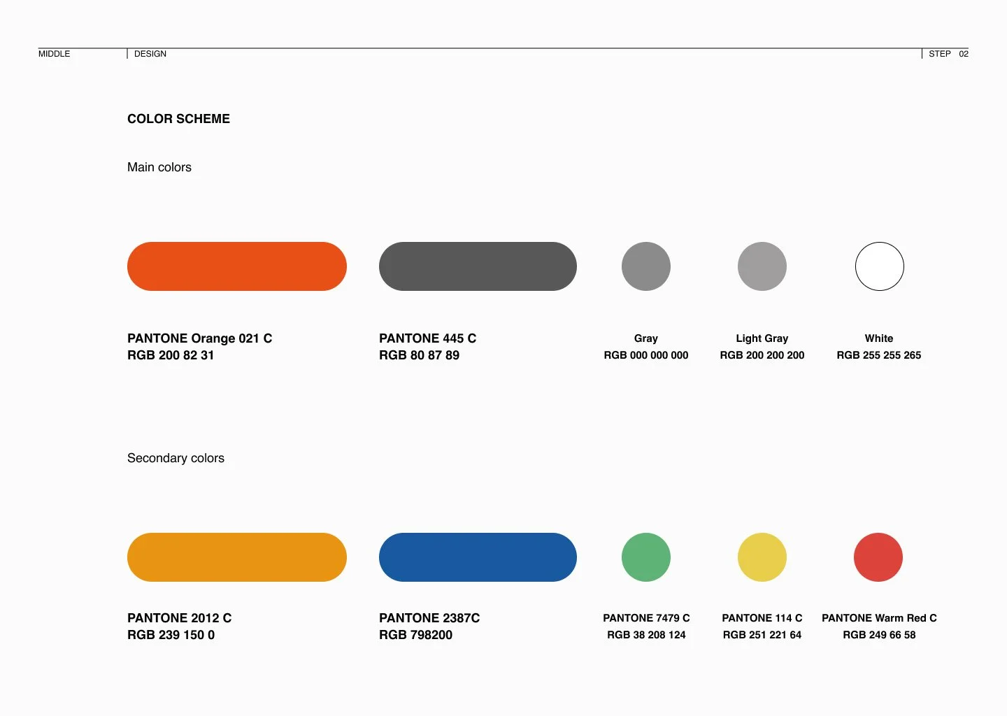
Vibrant Visual Identity: I departed from conventional biotech blues and greens, selecting Vibrant Orange and Professional Red as the primary palette. This choice injects energy and life into the brand, ensuring it stands out as both modern and approachable.
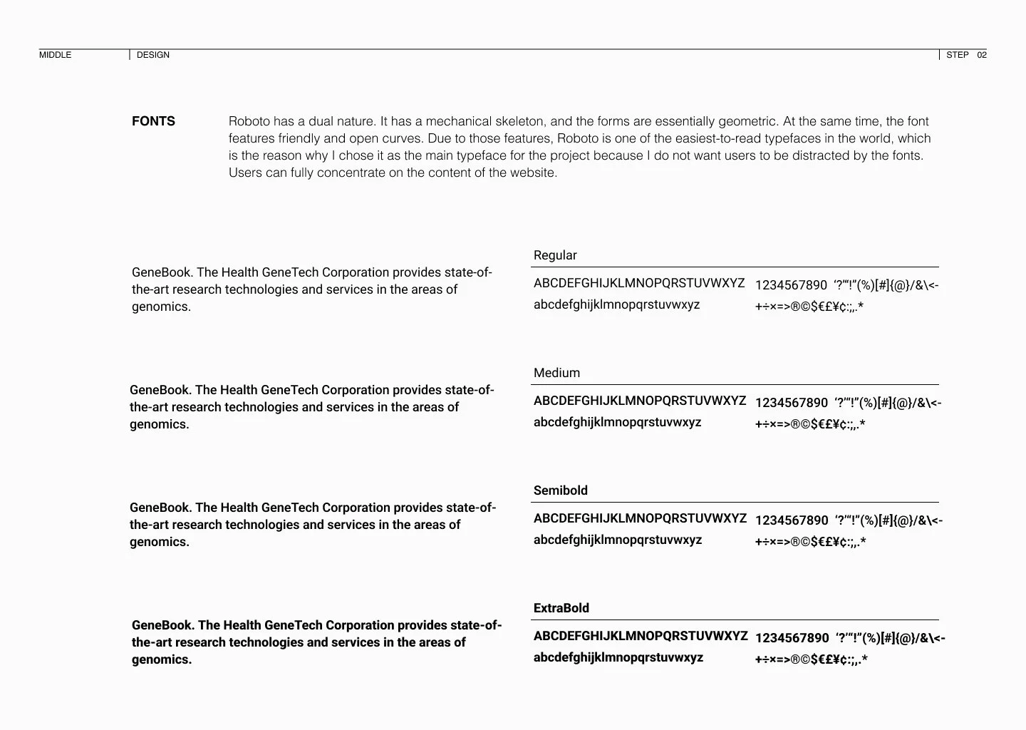
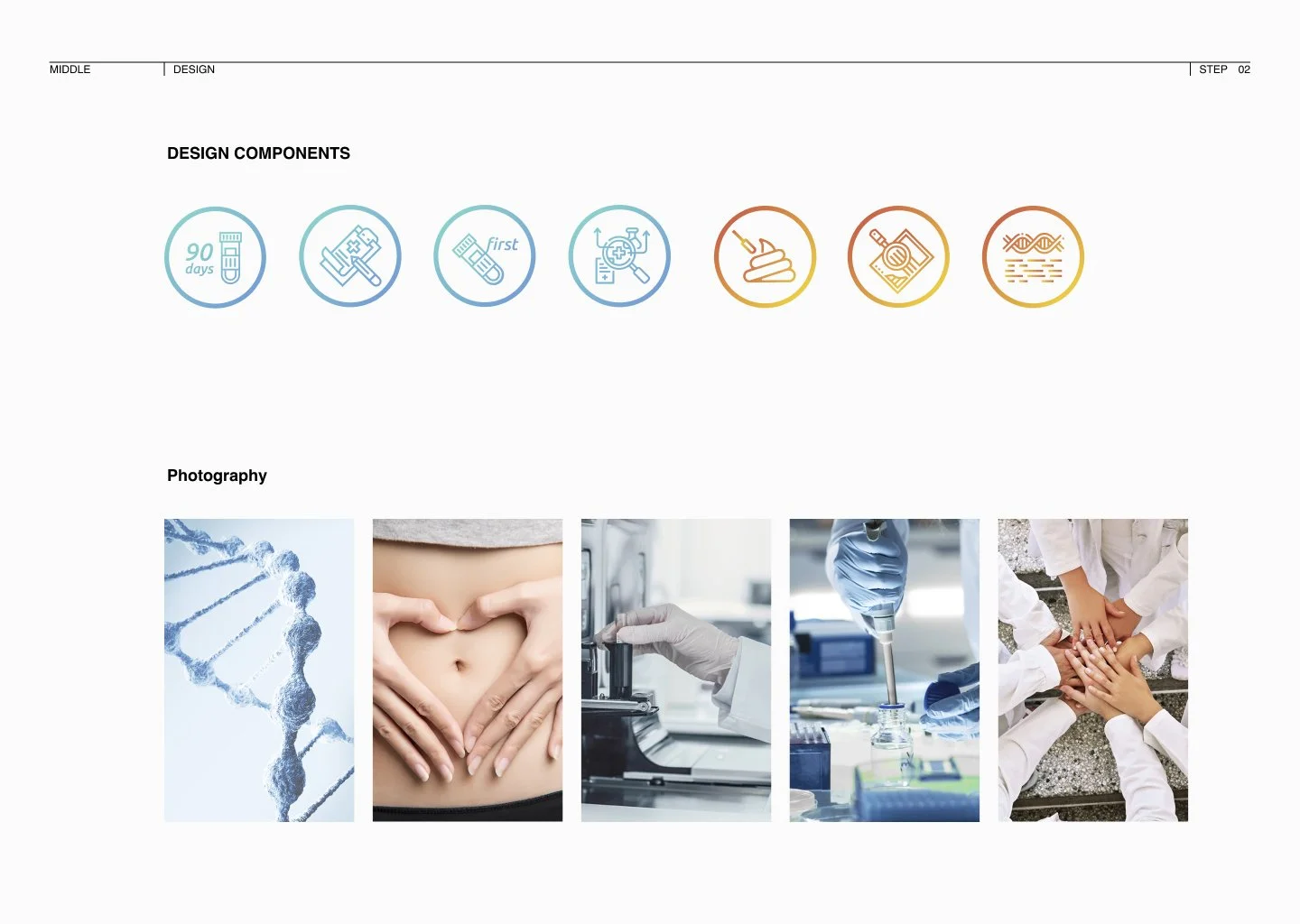
Systemisation: To ensure long-term scalability, I delivered a complete CI Brand Manual covering logotype standards, a 12-column grid system, and unified design components.
Design Process & User Research Roadmap
1. Discovery & Requirement Alignment
Stakeholder Interviews: Collaborated deeply with business owners to define the "Why" behind the rebrand and align on core project objectives.
Competitive Analysis: Performed a systematic analysis of competitors to identify market gaps and opportunities for differentiation.
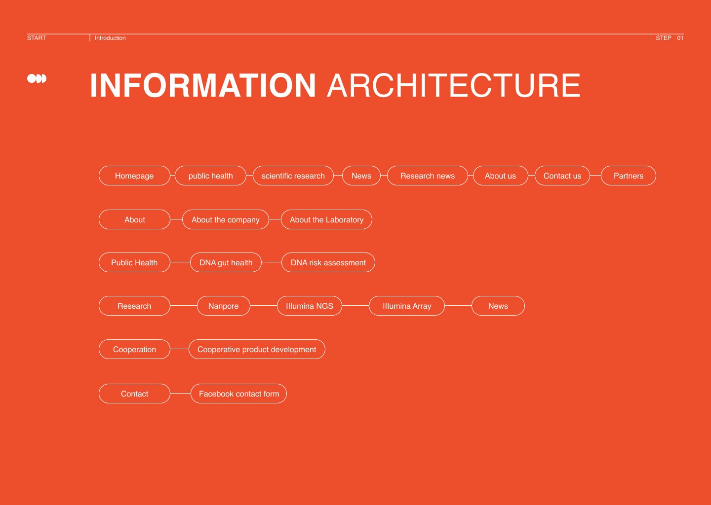
2. Architecture & Internal Validation
Information Architecture (IA): Established a clear content hierarchy to simplify complex genomic services.
Internal Usability Testing: Conducted tests with employees to refine the Navigation Bar and simplify "Instructional Steps" for testing services, ensuring the core workflow was frictionless.
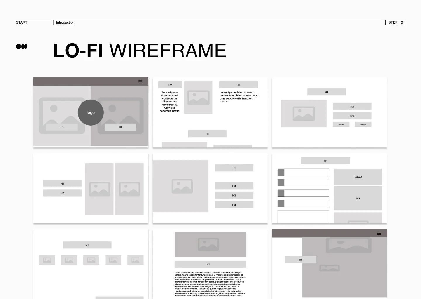
3. High-Fidelity Design & External Validation
Hi-Fi Prototyping: Integrated the new CI into a high-fidelity web interface.
External Usability Testing: Engaged potential users to validate the interface, leading to a pivotal strategic discovery regarding user trust.
4. Key Strategic Insight: Building Trust via Value Perception
The Challenge: During external testing, I found that professional medical equipment names (e.g., NGS) were intimidating and meaningless to the general public.
The Design Solution: I moved beyond technical jargon and strategically highlighted the market value and premium pricing of the equipment.
The Impact: By translating "high-tech" into "high-value," users immediately understood they were receiving elite-level service. This built a foundation of trust and perceived quality, even for those with no medical background.
Design Guideline
Design Represent
Project Takeaways
Strategic Design & Branding
Holistic Transformation: Successfully integrated graphic design, UI design, and Corporate Identity (CI) to revitalize a premier Taiwanese biotechnology company.
Narrative Identity: By utilizing Morse code as the primary design structure, the brand was repositioned as a "Biotechnological Decryptor," translating complex genetic data into accessible health insights.
Emotional Connectivity: Transitioned from cold, traditional biotech tones to a "Vibrant Orange" and "Professional Red" palette, balancing scientific rigor with a youthful and approachable personality.
Systemic Scalability: Established a rigorous CI manual, including specialized logotypes, a 12-column grid system, and typography standards using Roboto for maximum readability.
User-Centric UX Insights
Trust Through Transparency: External usability testing revealed that highlighting the market value of professional equipment bridged the knowledge gap for laypeople, establishing foundational trust in service quality.
Intuitive Information Architecture: Refined the navigation bar and simplified instructional steps during internal testing to ensure complex genomic information remained easily navigable for potential customers.
Actionable Data Insights: Qualitative research confirmed that 80% of users value high-quality content over price, reinforcing the need for clear diagrams to present the testing process effectively.