Genebook
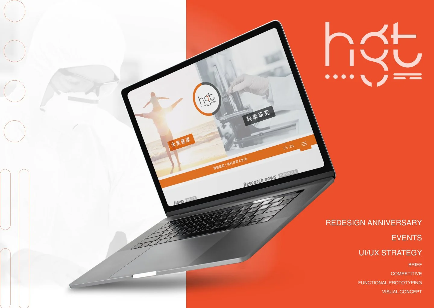
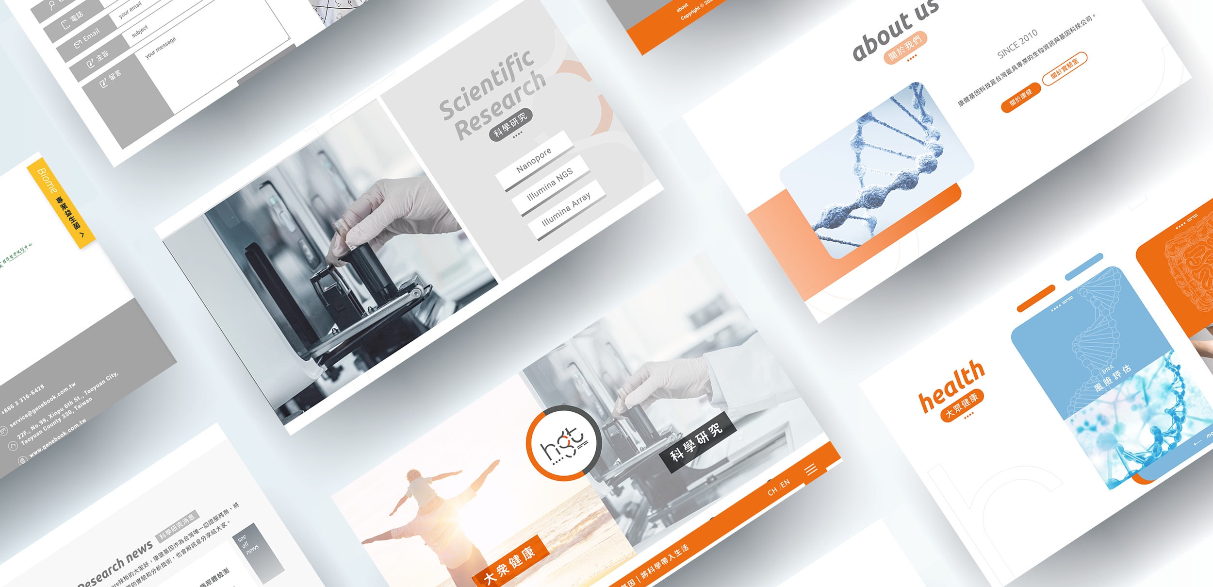
Marking the 10th anniversary of Health GeneTech Corp., a leader in Taiwan's biotechnology sector, I led a comprehensive 4-month rebranding initiative. As Lead Product Designer, I managed the end-to-end transformation of the Corporate Identity (CI) and official website — shifting the brand from a traditional "B2B lab" image to a professional yet vibrant "human-centric health partner".
Health GeneTech's existing identity relied on cold, clinical visuals that resonated with lab partners but alienated the general public. The brand needed to communicate trust, modernity, and accessibility simultaneously — without losing scientific credibility. Additionally, professional medical terminology (e.g., "NGS") was intimidating and meaningless to everyday users.
During external testing, I discovered that translating "high-tech" into "high-value" — by highlighting the market value and premium pricing of equipment — immediately built user trust, even for those with no medical background.
Stakeholder interviews to define the "Why" behind the rebrand. Competitive analysis to identify market gaps and differentiation opportunities.
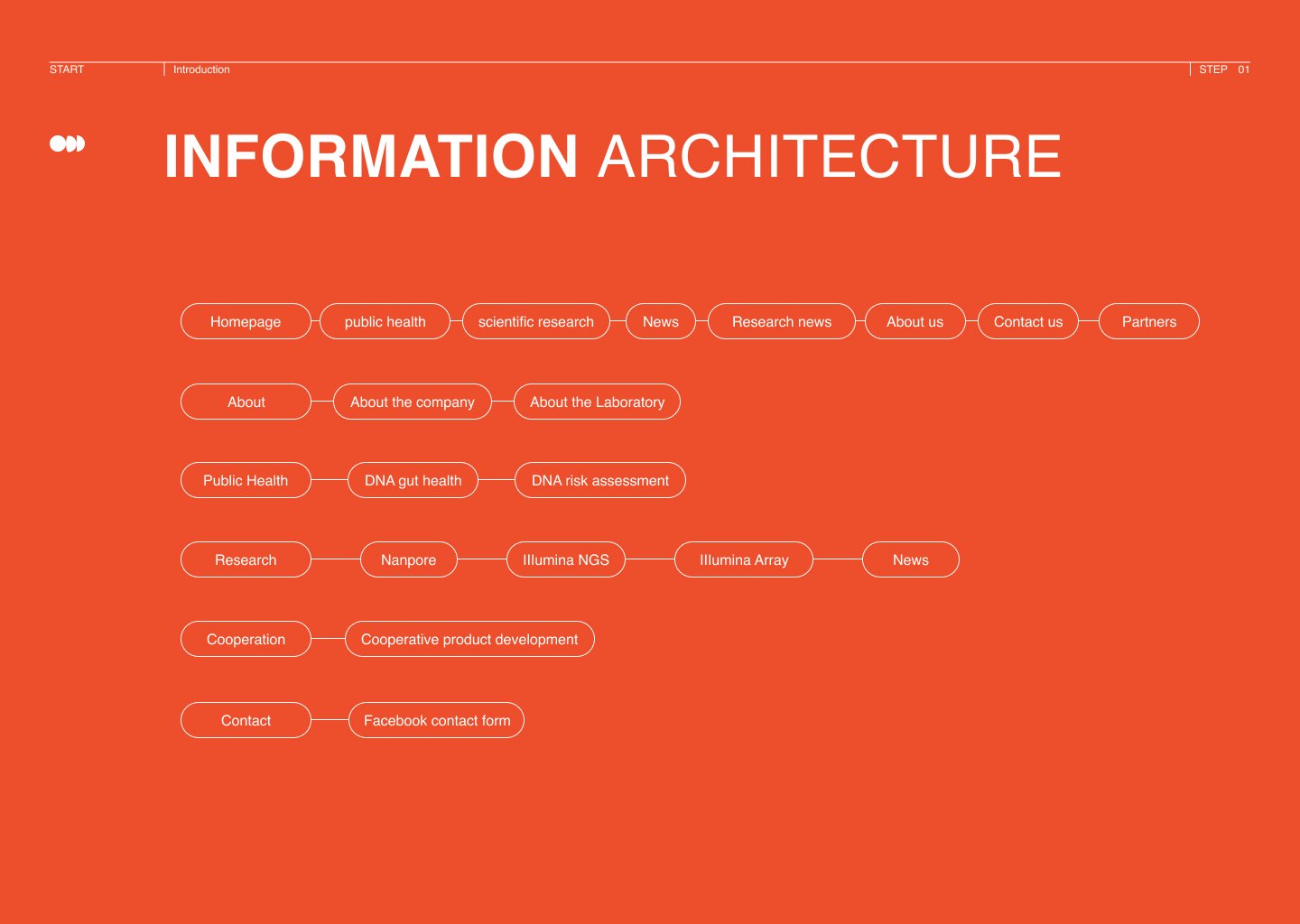
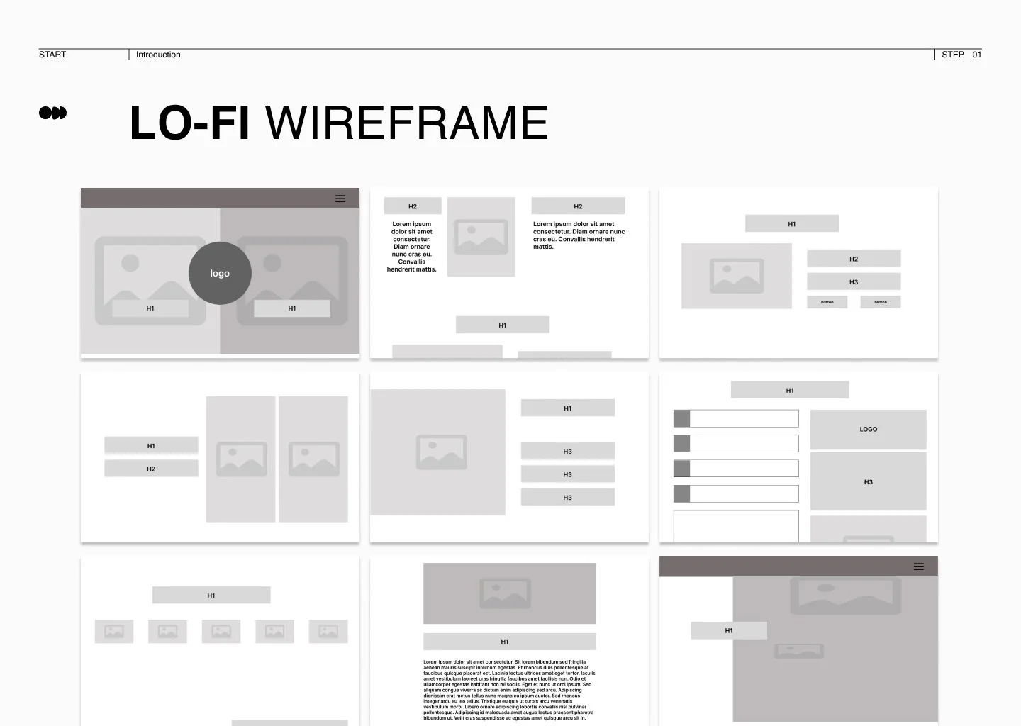
Established a clear Information Architecture to simplify complex genomic services. Internal usability testing refined the navigation bar and simplified "Instructional Steps".
Integrated the new CI into a high-fidelity web interface. External usability testing with potential users validated the interface and surfaced the key trust insight.
Moved beyond technical jargon to strategically highlight market value — translating complex science into perceived quality and building immediate user trust.
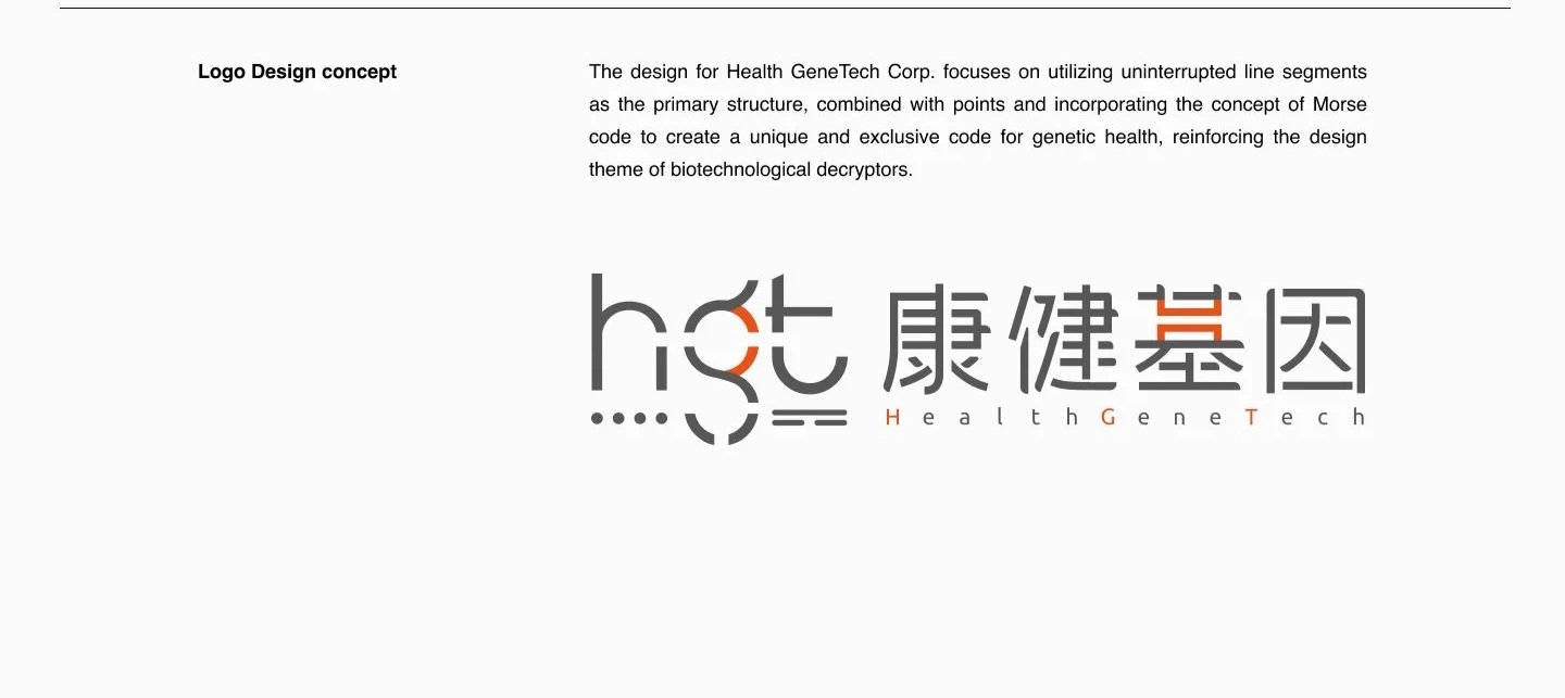
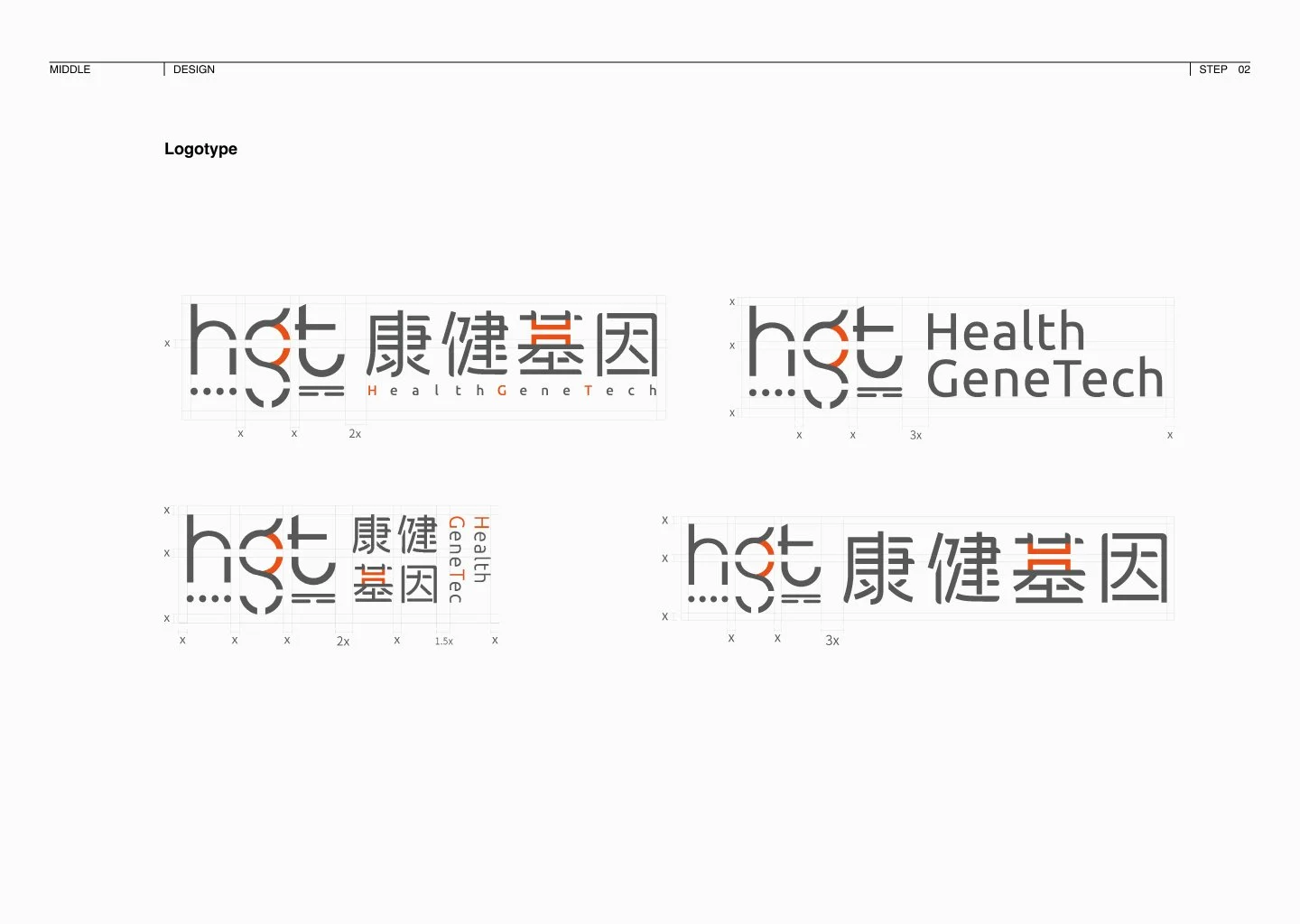
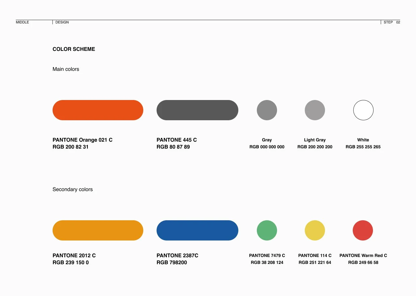
I replaced the outdated human-shaped trademark with a sophisticated logo inspired by Morse Code — symbolising that while DNA is the "source code" of life, Health GeneTech acts as the expert "decoder." I departed from conventional biotech blues and greens, selecting Vibrant Orange and Professional Red as the primary palette, injecting energy and approachability into the brand.
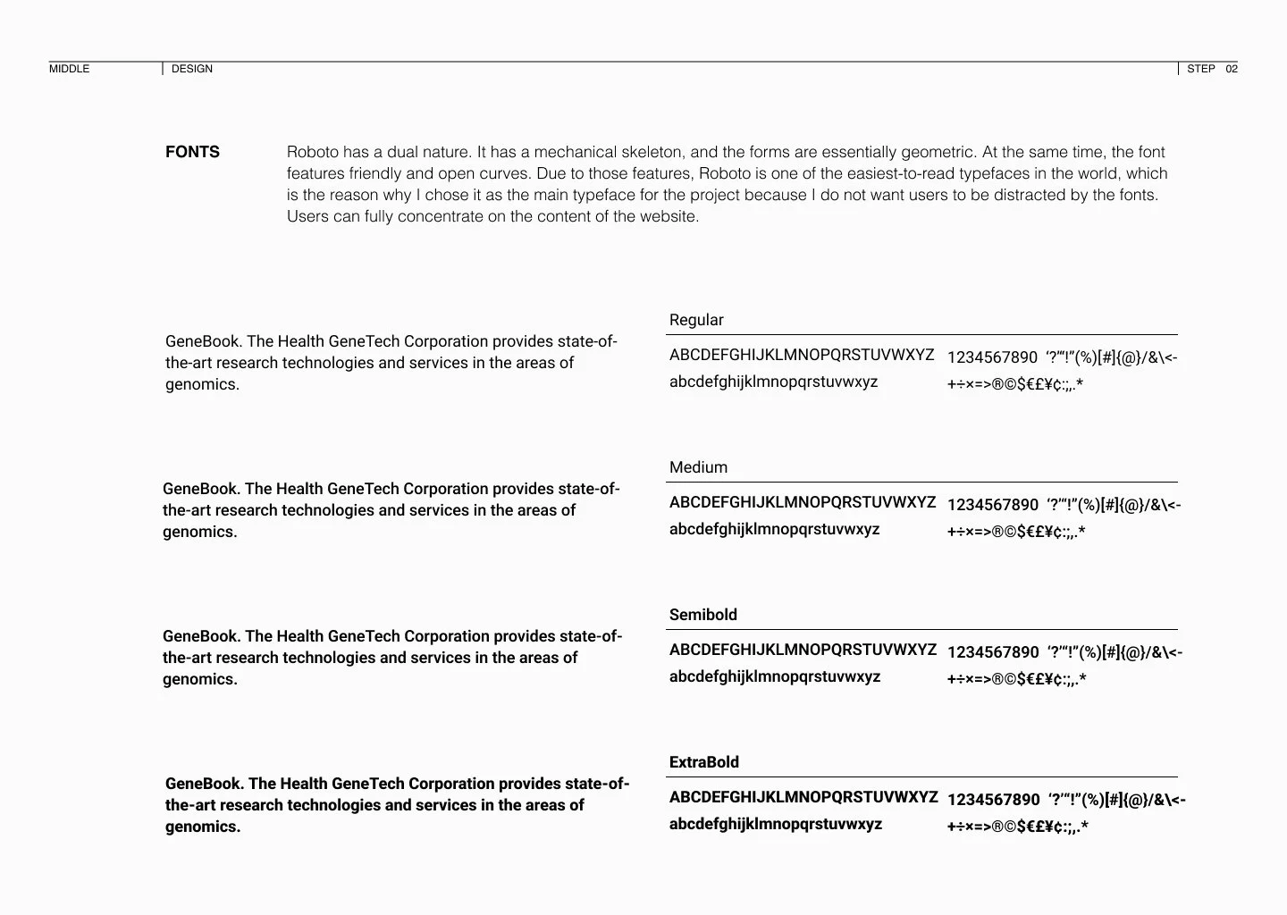
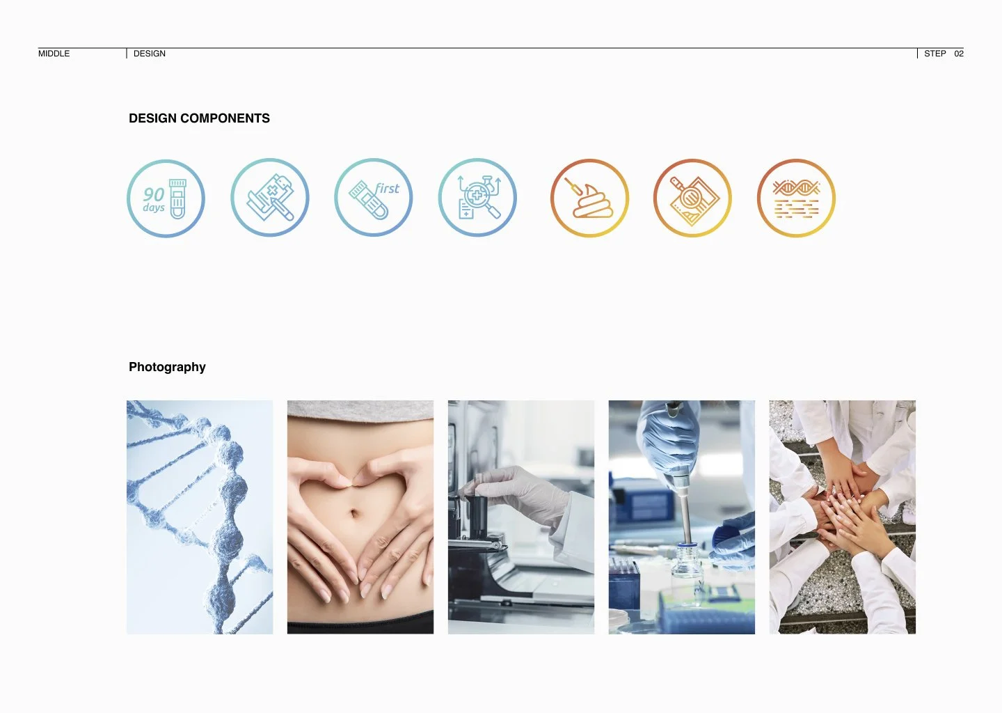
To ensure long-term scalability, I delivered a complete CI Brand Manual covering logotype standards, a 12-column grid system, and unified design components — making the system handoff-ready from day one.
Qualitative research confirmed that clear diagrams presenting the testing process were the most effective trust-building mechanism — guiding the final information hierarchy.